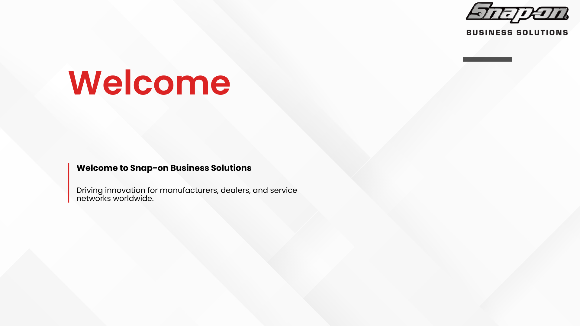
Client Welcome Presentation Redesign


As part of my internship at Snap-on Business Solutions, I evaluated and redesigned a customer-facing welcome presentation used to introduce prospective and new clients to the company, its solutions, and value proposition.
The project focused on improving the overall user experience of the presentation by refining information hierarchy, modernizing visual design, improving content organization, and creating a more engaging onboarding experience for audiences unfamiliar with Snap-on Business Solutions.
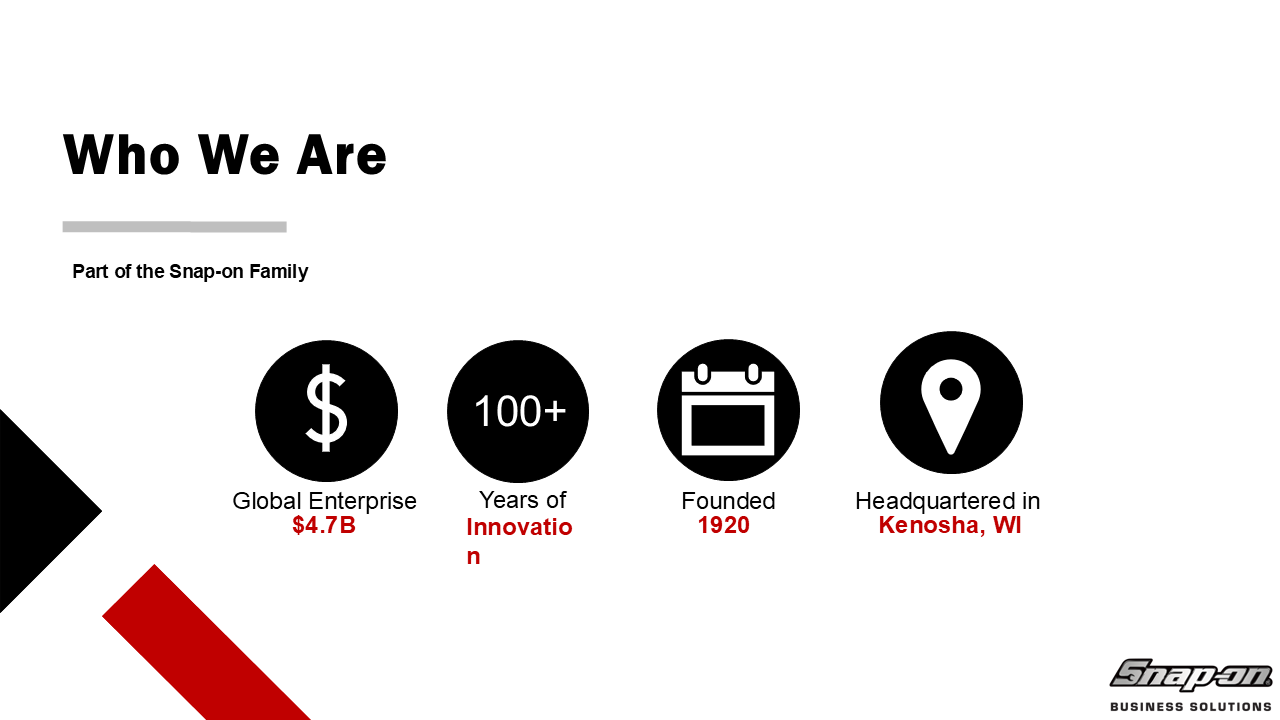
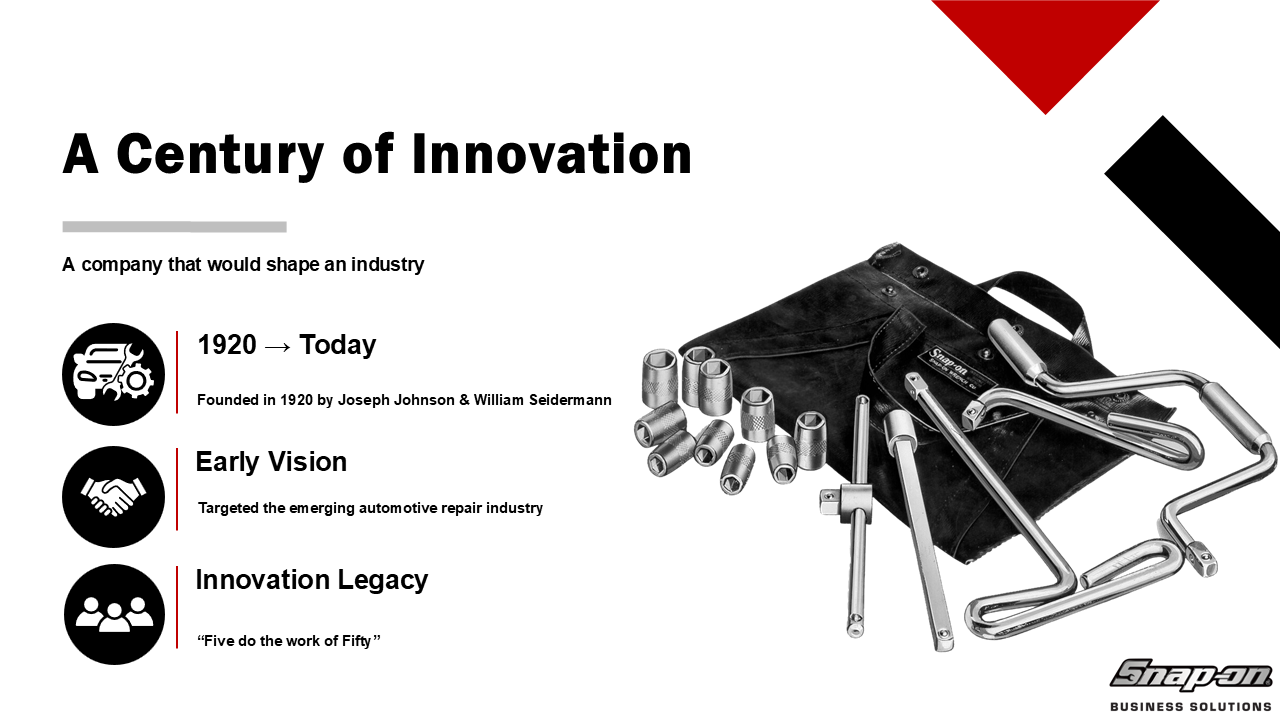
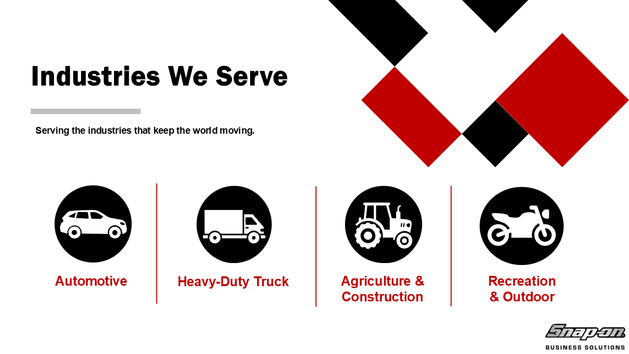
To explore different approaches, I developed four distinct redesign concepts while maintaining alignment with Snap-on branding and business objectives.
Project Goals
Improve information hierarchy and content flow
Modernize the visual design
Increase readability and accessibility
Create a more engaging audience experience
Strengthen brand consistency
Better communicate key services and value propositions
Reduce visual clutter and improve slide usability
My Role
Evaluated the existing presentation to identify opportunities for visual and structural improvement.
Developed four distinct redesign concepts with varying visual approaches.
Improved slide layouts, typography, spacing, and content hierarchy.
Modernized the overall appearance while maintaining brand consistency.
Focused on clarity, readability, and professional storytelling.
My Process
-
I began by reviewing the current presentation and identifying opportunities for improvement in:
Visual hierarchy
Slide consistency
Content organization
Branding
Readability
Audience engagement
This evaluation helped establish priorities for the redesign process and guided future design decisions.
-
Using the findings from the review, I developed four redesign concepts exploring different approaches to:
Layout structure
Typography
Color application
Visual emphasis
Information architecture
Content presentation
Each concept focused on creating a cleaner and more modern experience while preserving the professionalism expected in customer-facing materials.
-
Throughout the redesign process, I iterated on:
Slide layouts
Content grouping
Headline treatments
Visual hierarchy
Supporting graphics
Brand elements
The goal was to improve comprehension and make information easier to navigate for both potential and existing customers.
UX/UI Considerations
Although this project was presentation-based, many UX principles were incorporated throughout the redesign process.
Information Architecture
Content was reorganized to create a more logical flow and reduce cognitive load.
User-Centered Communication
Slides were designed around the needs of the intended audience, focusing on clarity, relevance, and ease of understanding.
Accessibility & Readability
Layouts and typography were refined to improve legibility and overall presentation usability.
Visual Hierarchy
Typography, spacing, and color were used to guide attention toward the most important information.
Consistency
Design systems were applied across slides to create a cohesive and predictable experience.
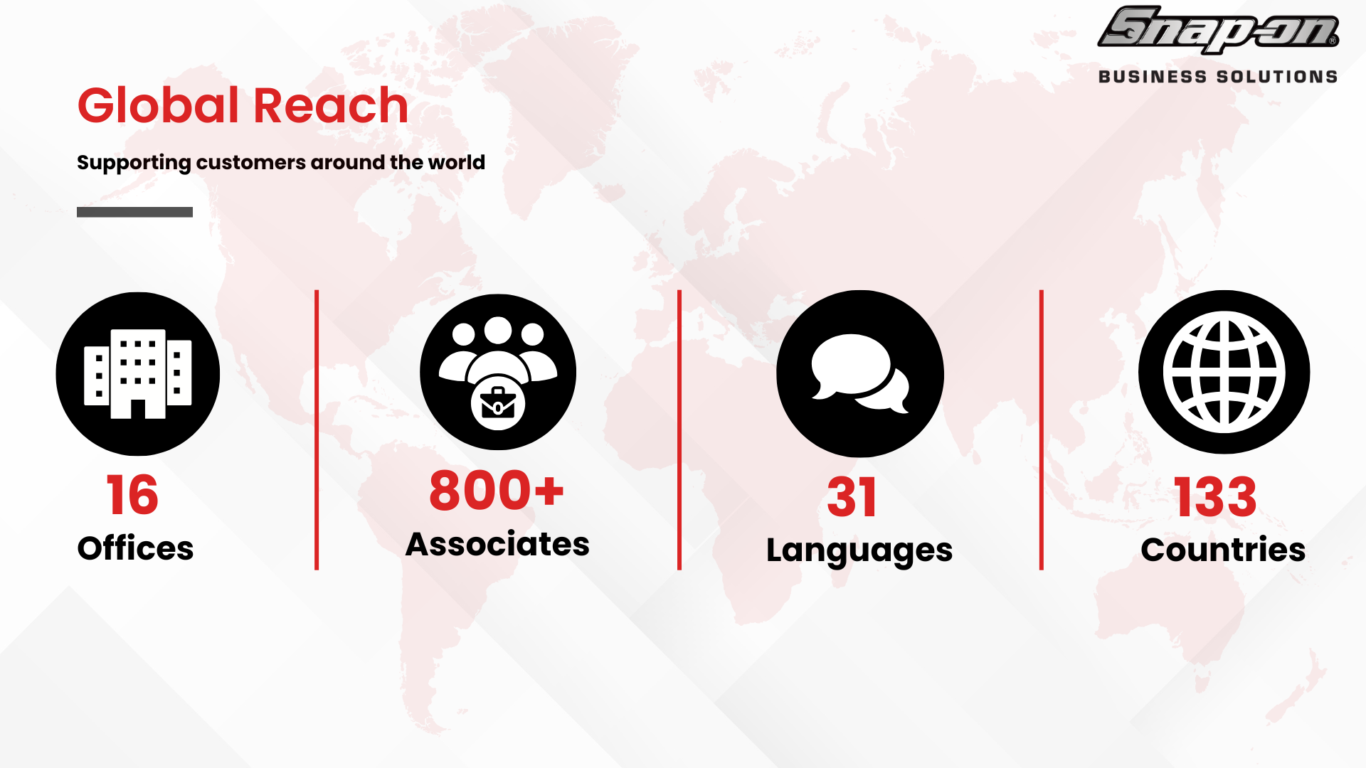
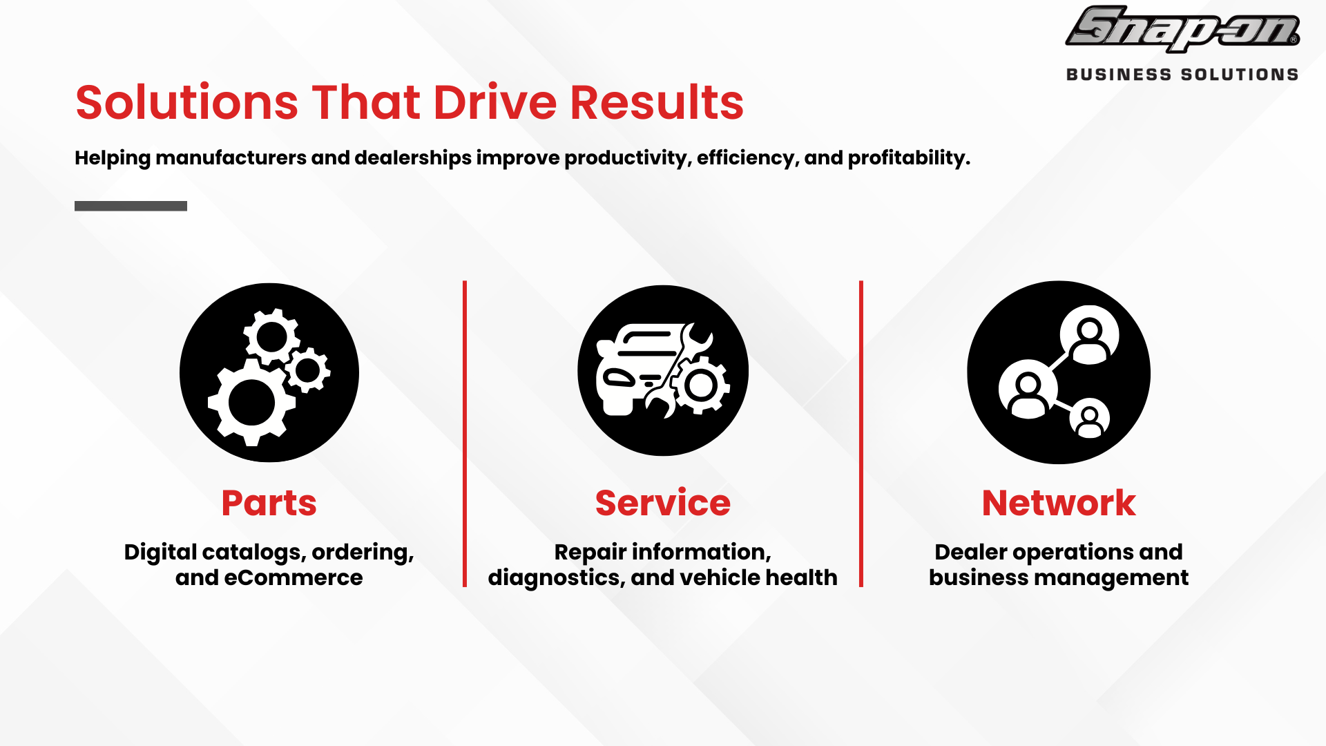
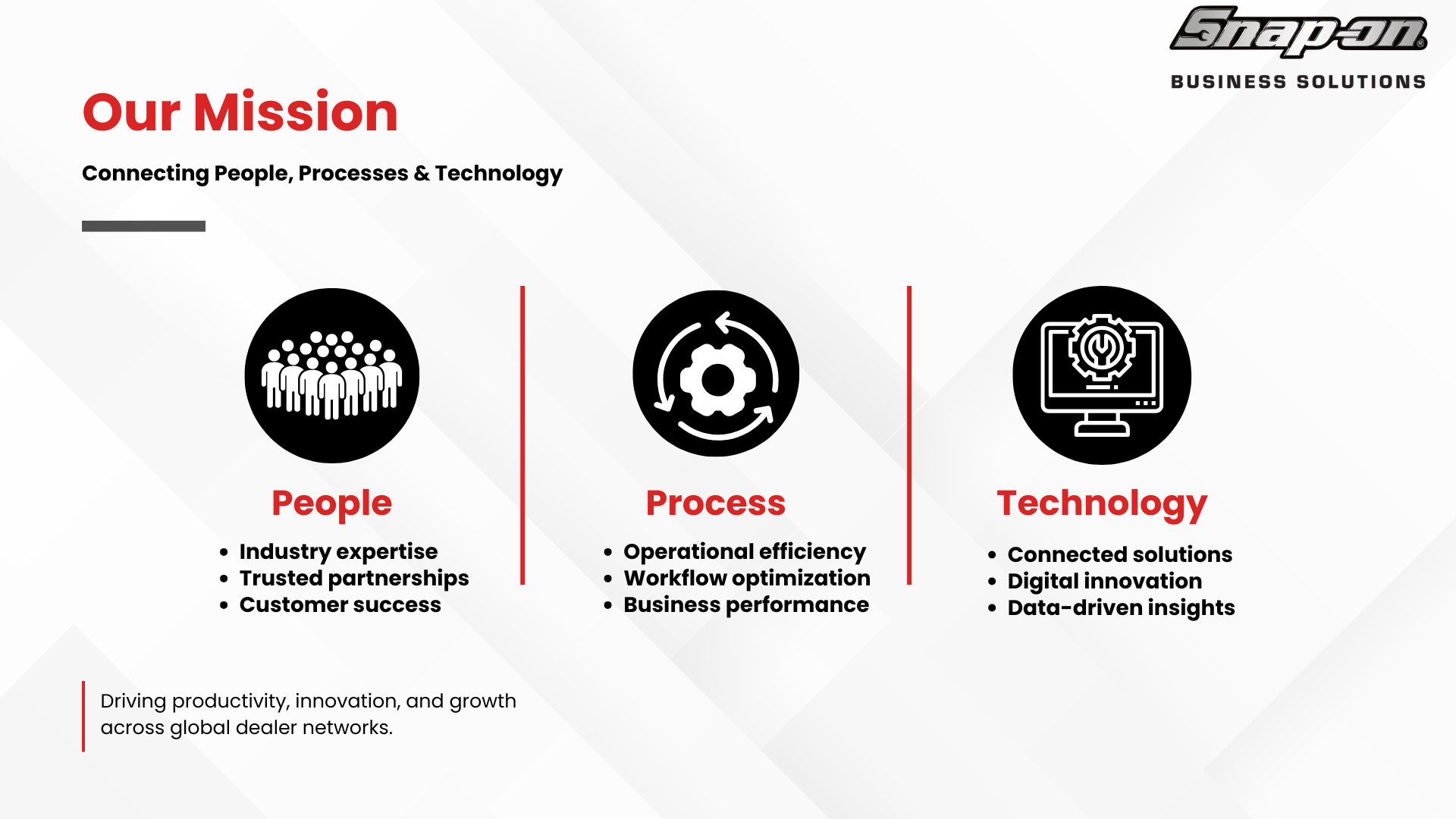
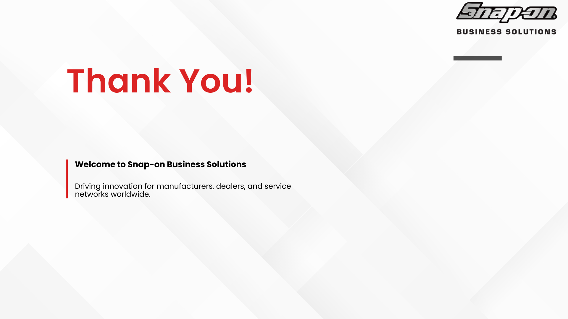
Reference Presentation

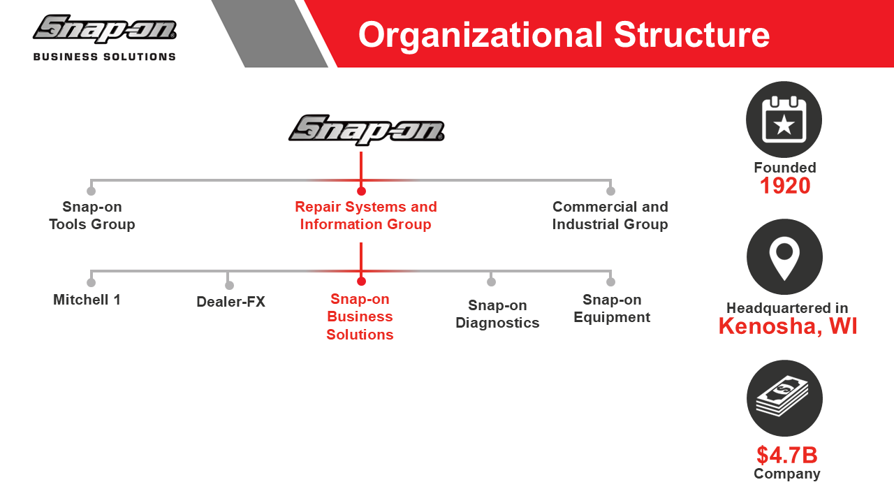







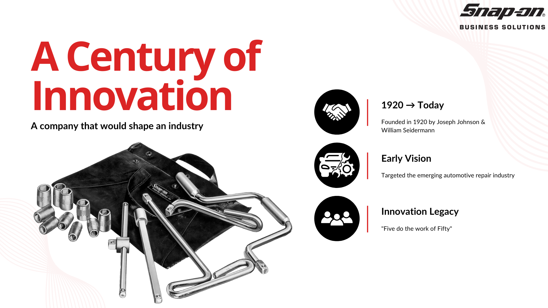
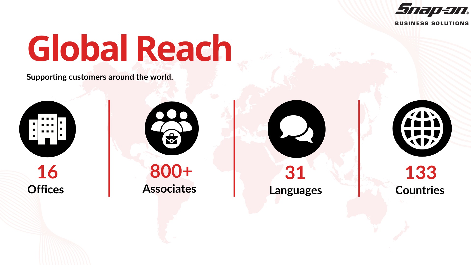
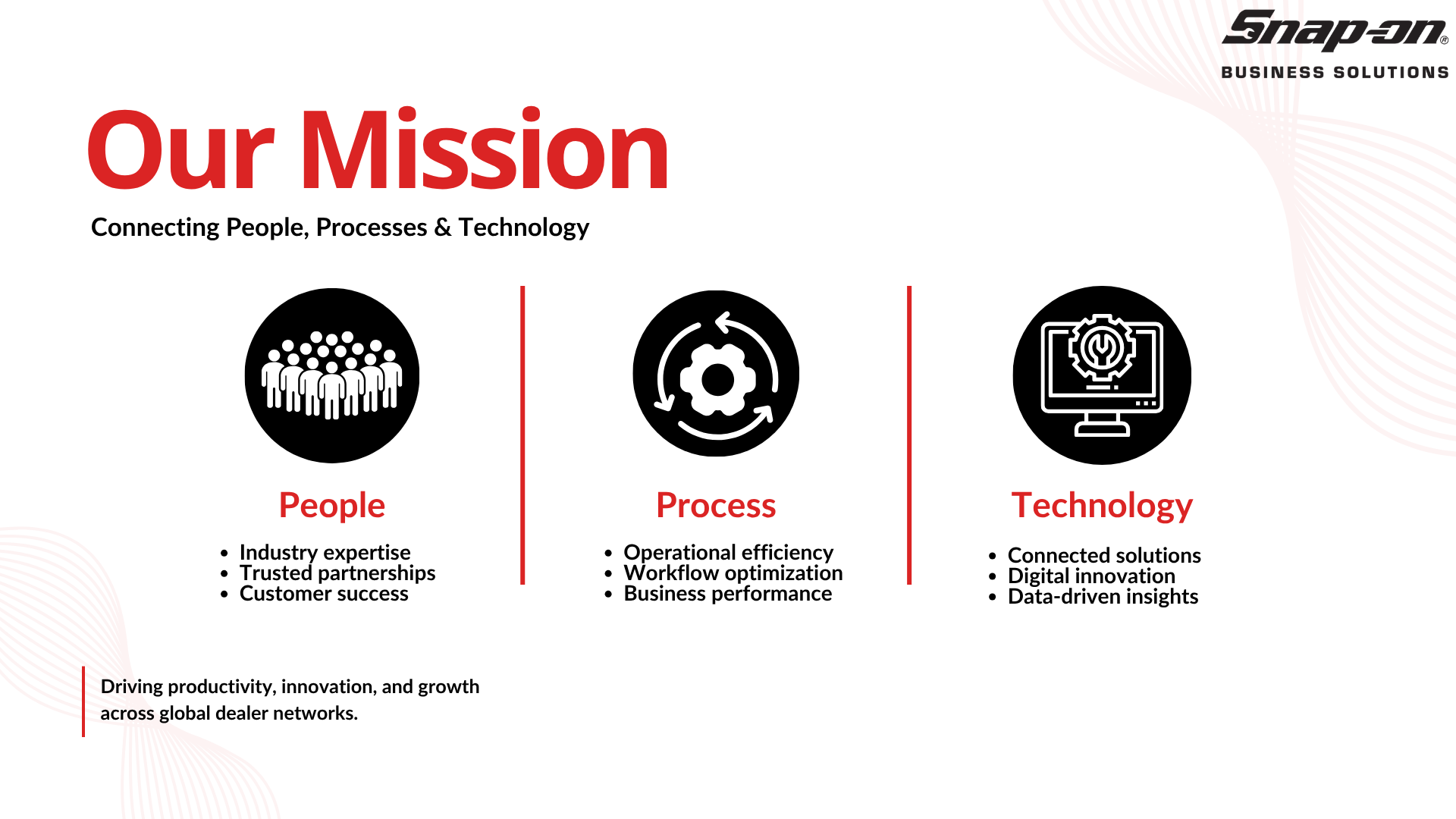
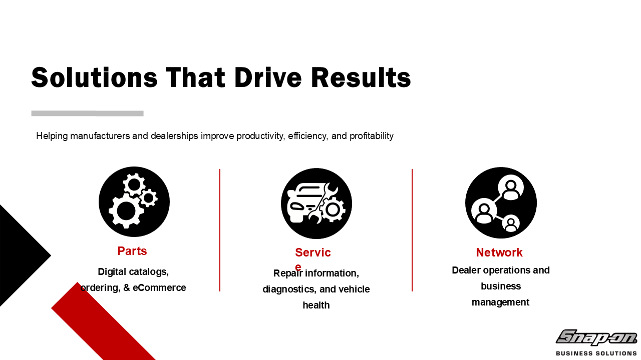
Version 1

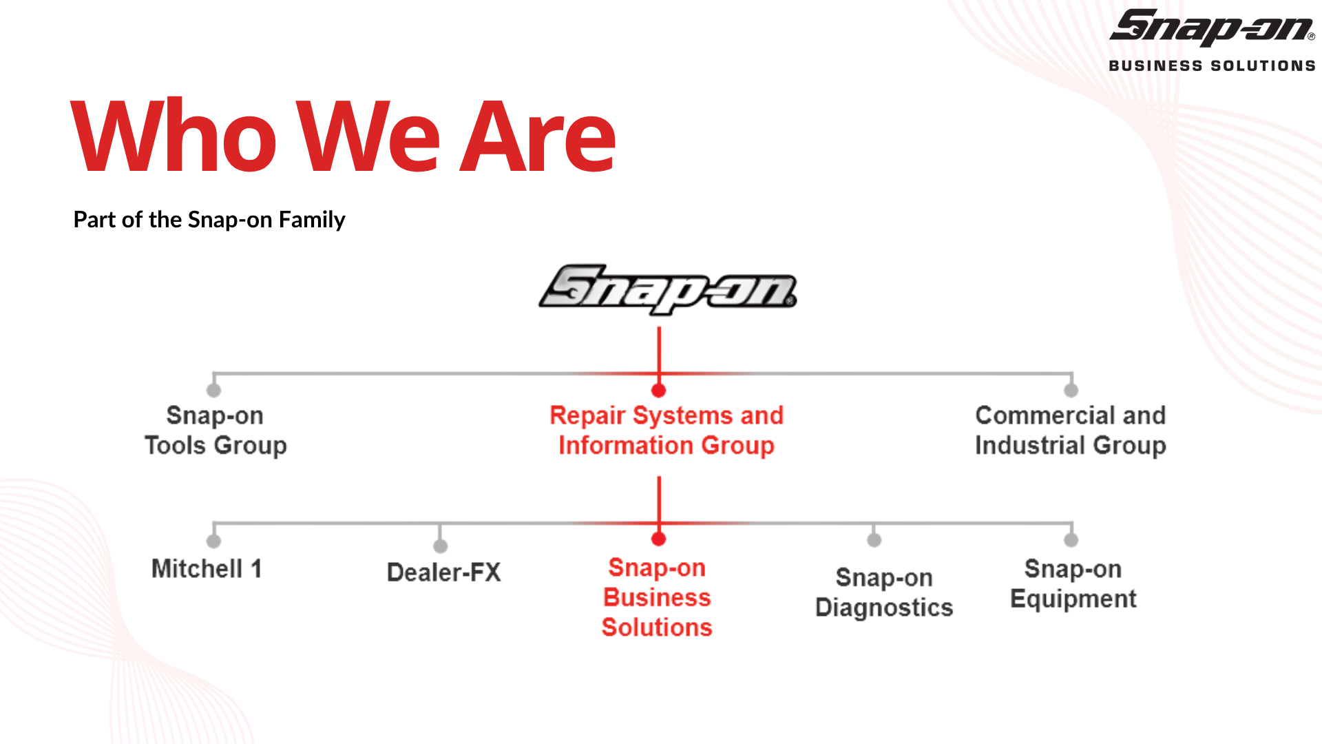
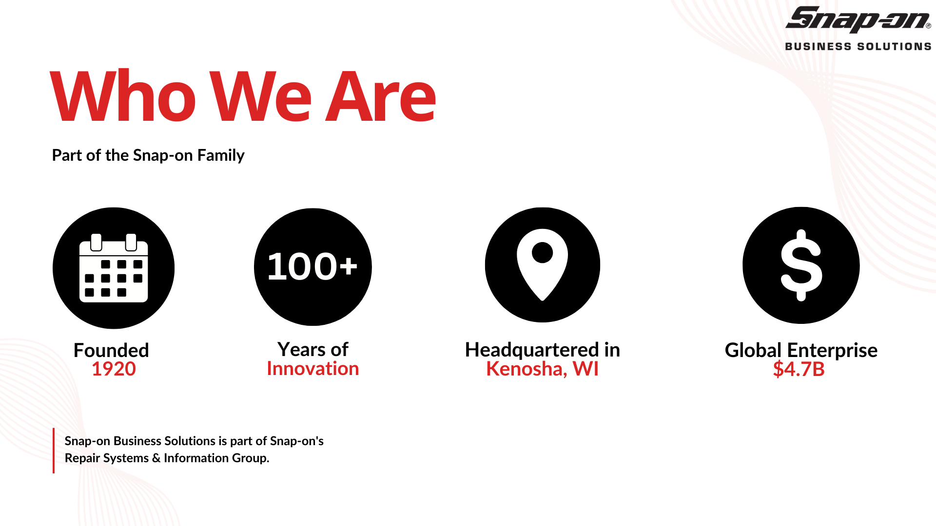





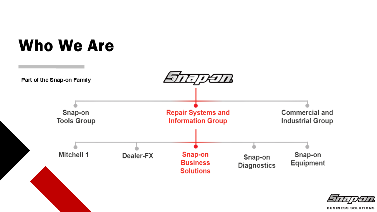
Version 2

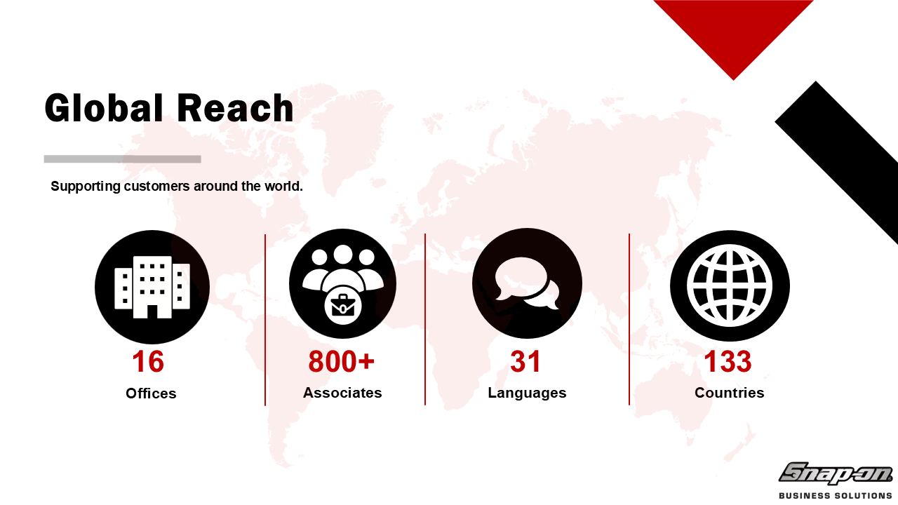


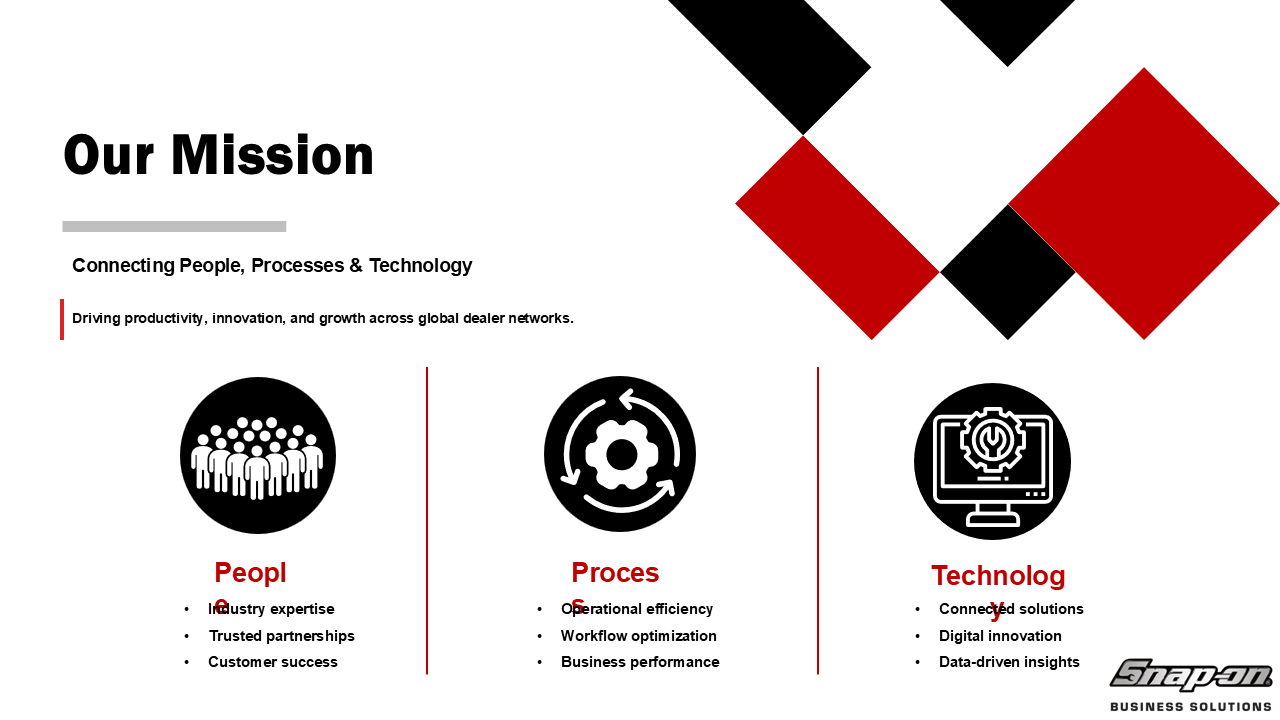

Version 3

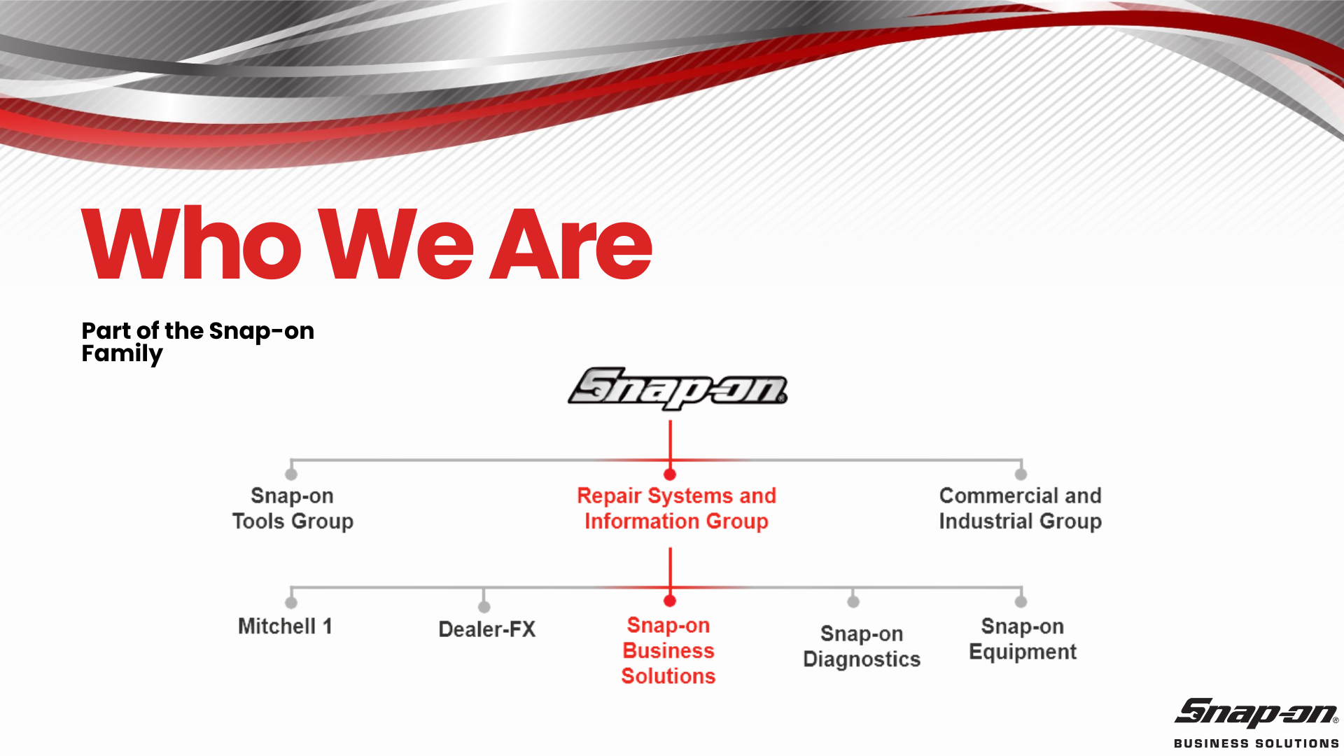
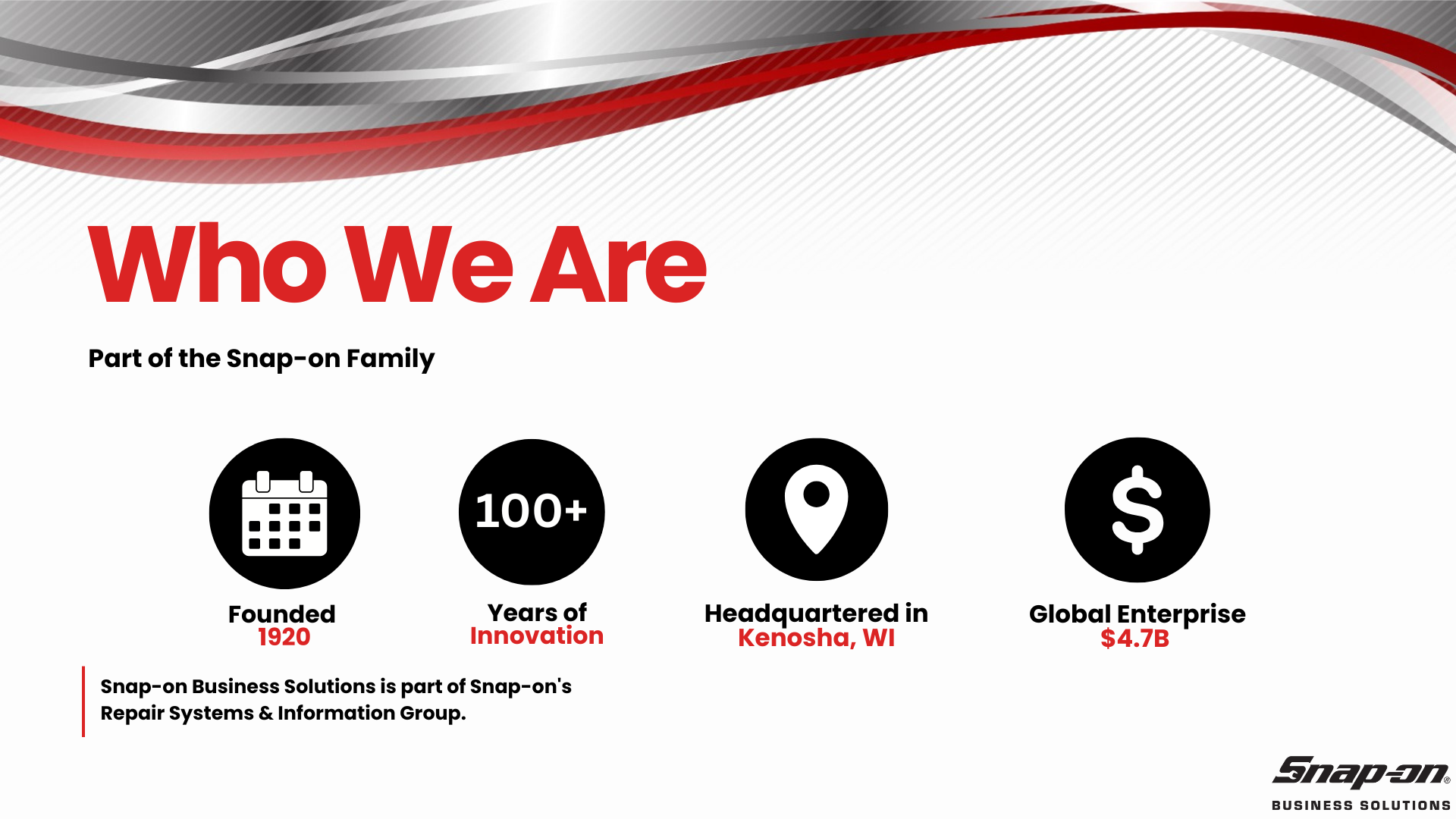
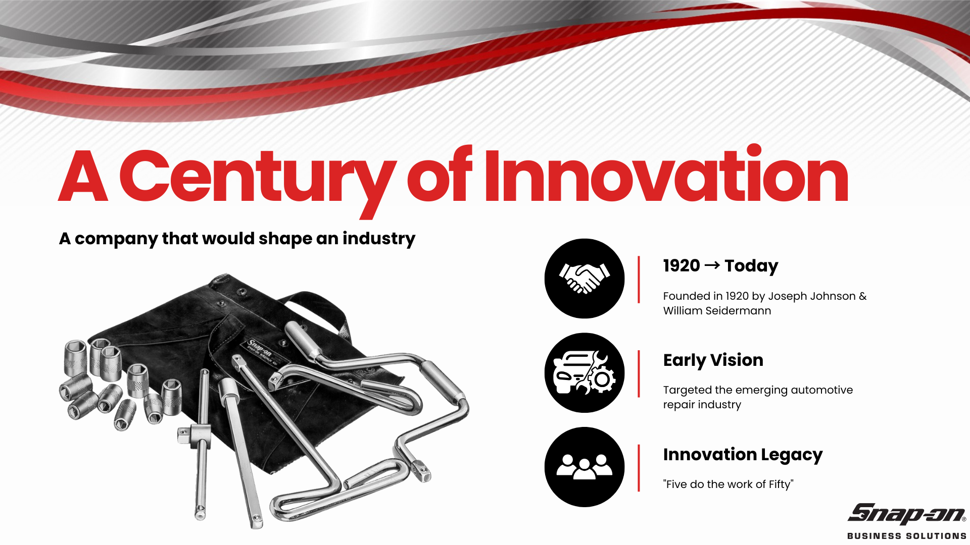
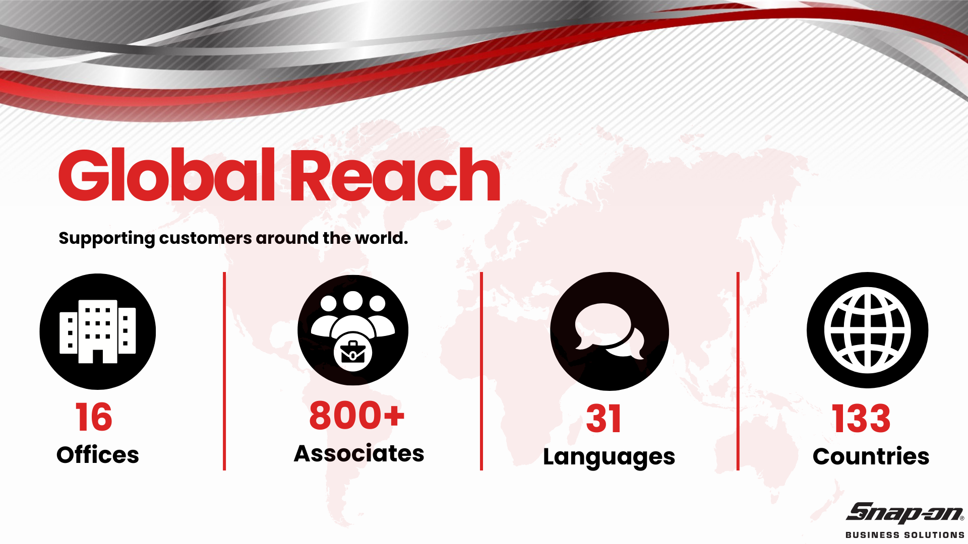

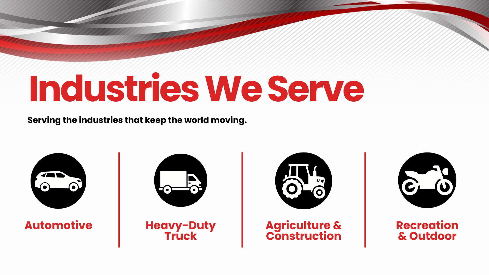

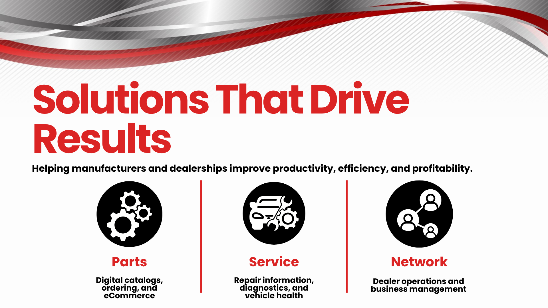
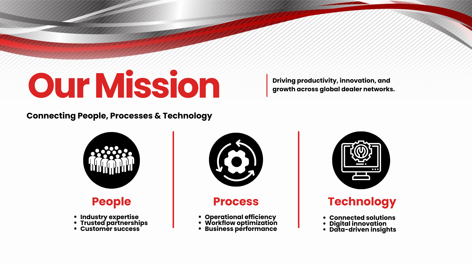

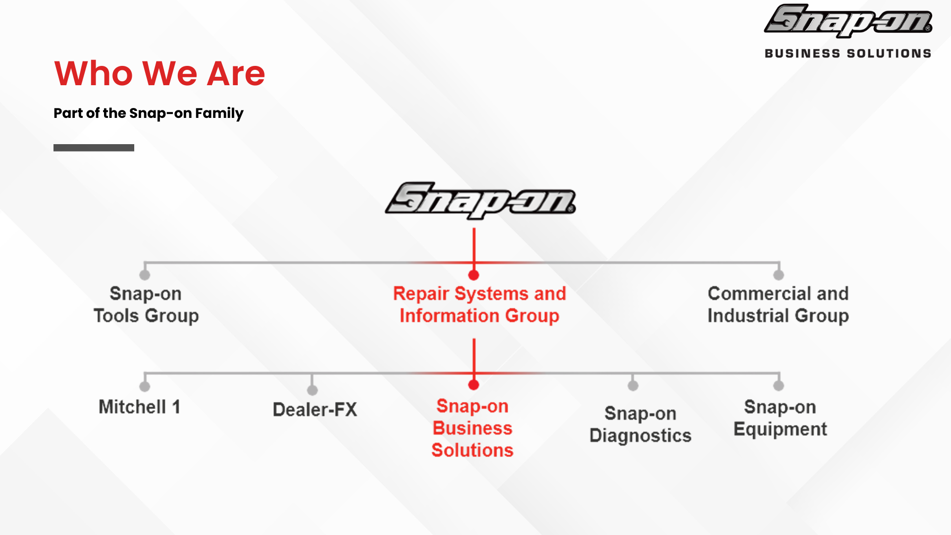
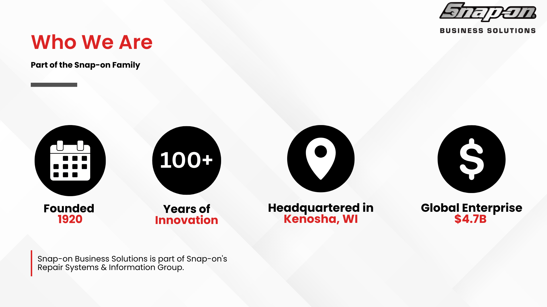
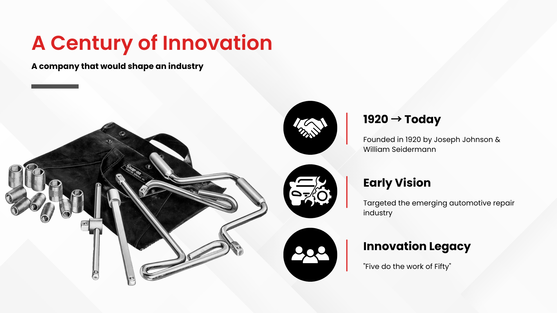
Version 4



Key Takeaways
This project strengthened my skills in:
UX/UI Design
Information Architecture
Visual Communication
Presentation Design
User-Centered Design
Content Strategy
Design Systems
Brand Consistency
